Graphic Identity Program
A graphic identity program helps an organization distinguish its print publications and electronic media from those of other institutions by conveying a signature look that is easily recognizable.
Pomona College’s graphic standards are intended to ensure that the use of unifying elements is coordinated to create a clear “family” look within sets of materials destined for the same general audience, as well as a coordinated look between all sets of College materials, while providing for enough flexibility to encourage creativity and originality.
This Graphic Standards Manual has been developed as a guide for members of the Pomona College community who produce College communications. It includes recommended typefaces, approved versions of the College mark and design guidelines for a range of materials.
The College Mark
The College mark, adopted by the College in 2013, is the identifying symbol for most official College graphic communications. Its form cannot be altered.
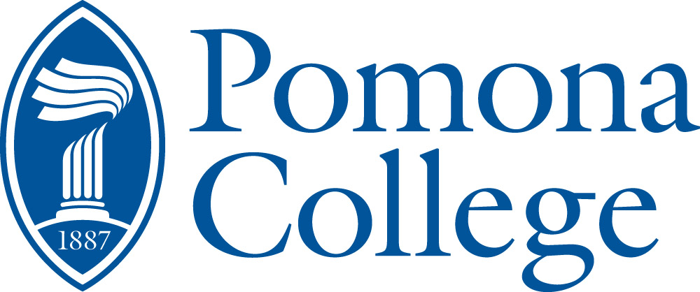
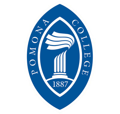
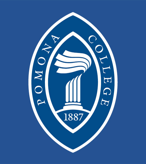
There are two versions of the mark. Version 1, the “logo version,” is to be used in most instances and is a graphic element combined with a two-line word-mark. Version 2, the “seal version,” is a stand-alone version that is never combined with a wordmark and is reserved for ceremonial uses (such as diplomas and banners).
The preferred color for the mark is Pomona Blue (Pantone 2935) or its 4-color process equivalent.
Separate versions of the mark artwork are available for printing in 1 color, 4 color process, for color reversals and for embossing.
Blue (and 4-color process)
Version 1 (“Logo Version”) of the College Mark
Version 2 (“Seal Version”) of the College Mark
Black or other single color
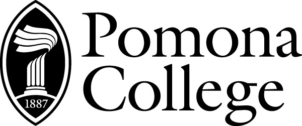
Version 1 (“Logo Version”) of the College Mark
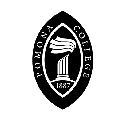
Version 2 (“Seal Version”) of the College Mark
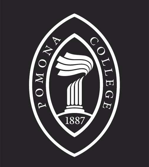
Dark backgrounds (Reversed)
![]()
![]()
Version 1 (“Logo Version”) of the College Mark
Version 2 (“Seal Version”) of the College Mark
Embossed
![]()
Size Limitations for the Mark
In banners and other oversized uses, there is no maximum size limitation for the mark. However, in normal usage in publications, the mark should not be reproduced at a size larger 6 inches wide for the “logo version” or 8 inches tall for the “seal version.”
Minimum Allowable Sizes of Reproduction
![]()
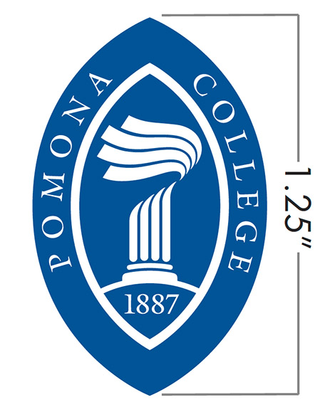
Under no circumstances should the mark be reproduced at a size less 1.25 inches in width for the “logo version” or 1.25 inches in height for the “seal version.”
Unacceptable Uses of the Mark
![]()
The graphic may not be reversed.(See reversed logo version.)
![]()
The mark may not be used over a photo or background that is too complex or high in contrast to permit it to be read easily.
![]()
The mark may not be used in settings with too little contrast.
![]()
The graphic element of the “logo version” of the mark may not be used alone or in combination with other text.
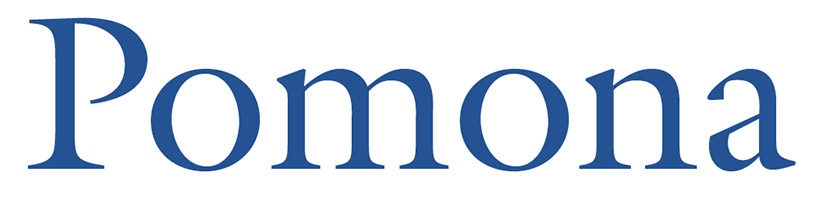
The Wordmark
In some instances, an acceptable alternative to the mark is the College wordmark.
The wordmark is intended primarily for publication mastheads and other instances in which the graphic elements of the College mark would interfere with other elements of design. Since the mark must be staged and cannot be reversed or applied over a complex background, the wordmark provides an alternative for such design situations.
The wordmark is always in ITC Galliard Roman, upper and lower case. In Photoshop, the initial capital is kerned –38, and the rest is kerned –19. In Quark XPress, the initial capital is kerned –10.
Stationery System
Standard Letterhead
(8.5” X 11”)
College Mark: 2.125” wide Printing: 1-color (Pantones 2935) Footer: Galliard Italic, 8 pt., 11 pt. leading Personalized Header: Gibson Book, 7 pt. all caps,
+6 pt. kern (Quark XPress)
(Same standards apply to Monarch stationery.)
#10 Envelope
(4.25” X 9.5”)
College Mark: 2” wide Printing: 1-color (Pantones 2935) Return Address: Galliard Italic, 8 pt., 11 pt. leading
(Same standards apply to Monarch envelope.)
Business Card
(3.5” X 2”)
College Mark: 1.75” wide
Printing: Logo—1-color (Pantones 2935) Information—Black
Typesetting: Name—Galliard Bold, 12 pt. Title—Gibson Book, 7 pt., all caps, 11 pt. leading Separation—6 points Information: Galliard Italic, 8 pt., 10 pt. leading
Recommended Typefaces
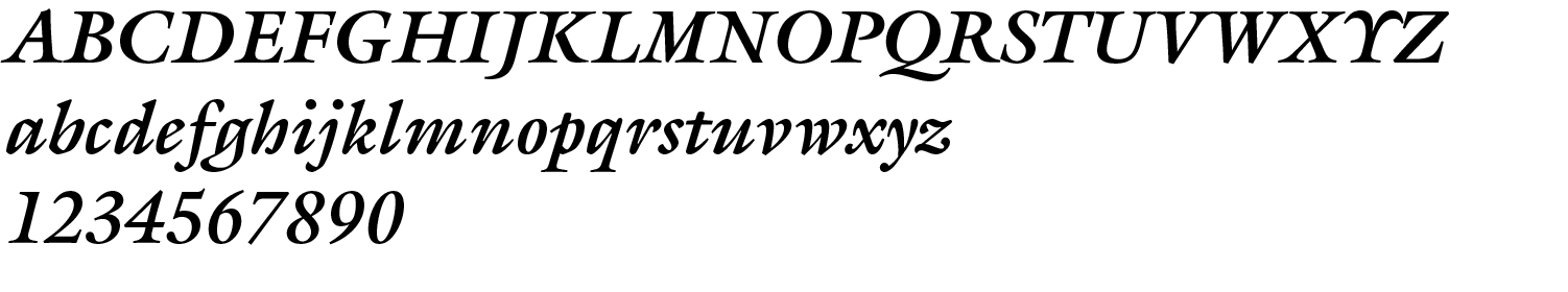
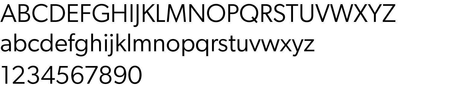
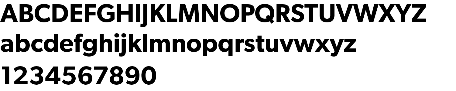
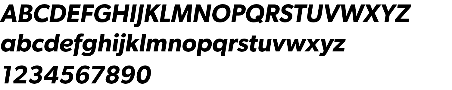
The Galliard (serif) and Gibson (sans-serif) typefaces are highly recommended for use as primary fonts in all print publications destined for outside audiences. On websites, Meta Pro is recommended for all uses. Contact the Communications Office if you need to obtain these printing fonts.
Primary Serif Font
ITC Galliard Roman: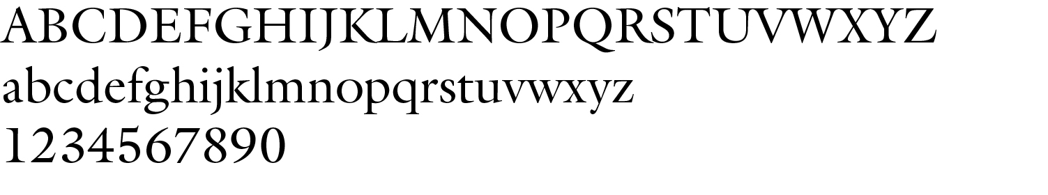
ITC Galliard Italic: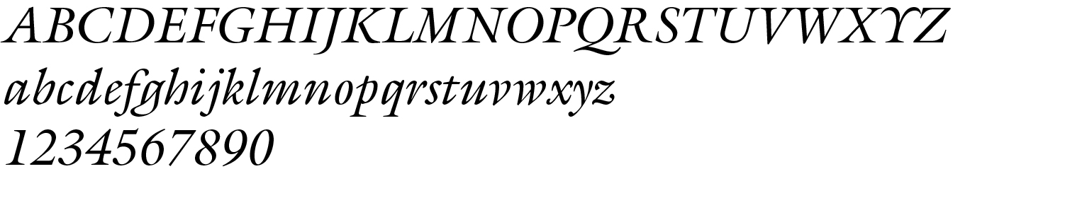
ITC Galliard Bold: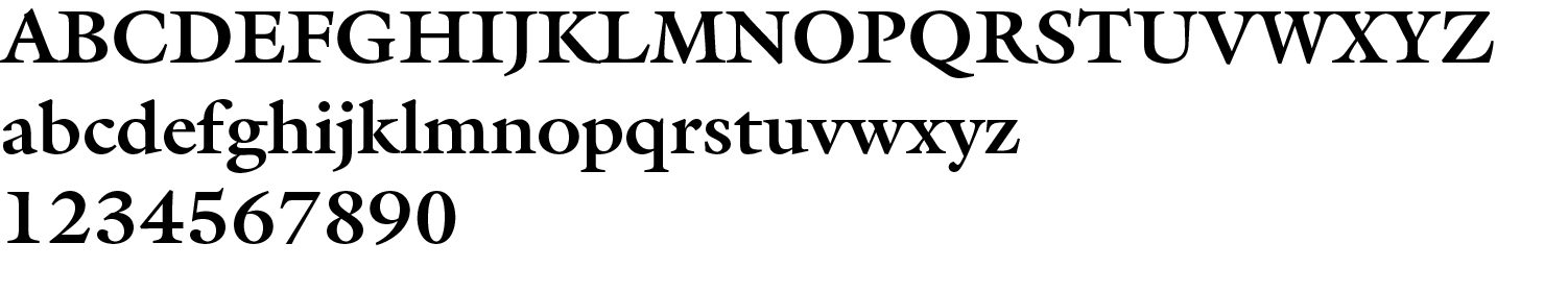
ITC Galliard Bold Italic: